UPDATE: added white layer below aircraft to make it pop and match the “International” text. UPDATE:@Alexander would this be disqualified because the IATA letters are “separated”? should I edit/recreate this one?
In the heart of the Southwest, JTX, Joshua Tree International is busy sending passengers to their destinations and bringing them home to the warm days and cool nights. Its the only city around as its surrounded by nothing but sandstone, rocks, and the occasional Joshua Tree and cacti for miles; so they only have one major international airport. I introduce you to their desert themed airport logo:
Southwest Desert
Font: Bebas Neue Bold Color: White (FFFFF)
Design Inspirations
Squares Idea came from adobe style brick made buildings.
UPDATE: Fixed IATA letters so they were not separated, adjusted outer framing (wasn’t even on both sides & made corners more rounded) & centered all text.
We move a little further east and into Farmland (FLD), where you find crops as far as the eyes can see. Here you may find all different size airports from, small fields, to midsize airports, all the way to international metropolitans! I introduce to you their home airport logo:
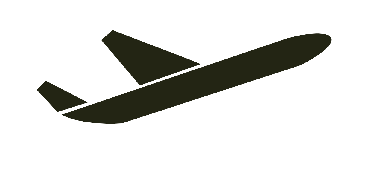
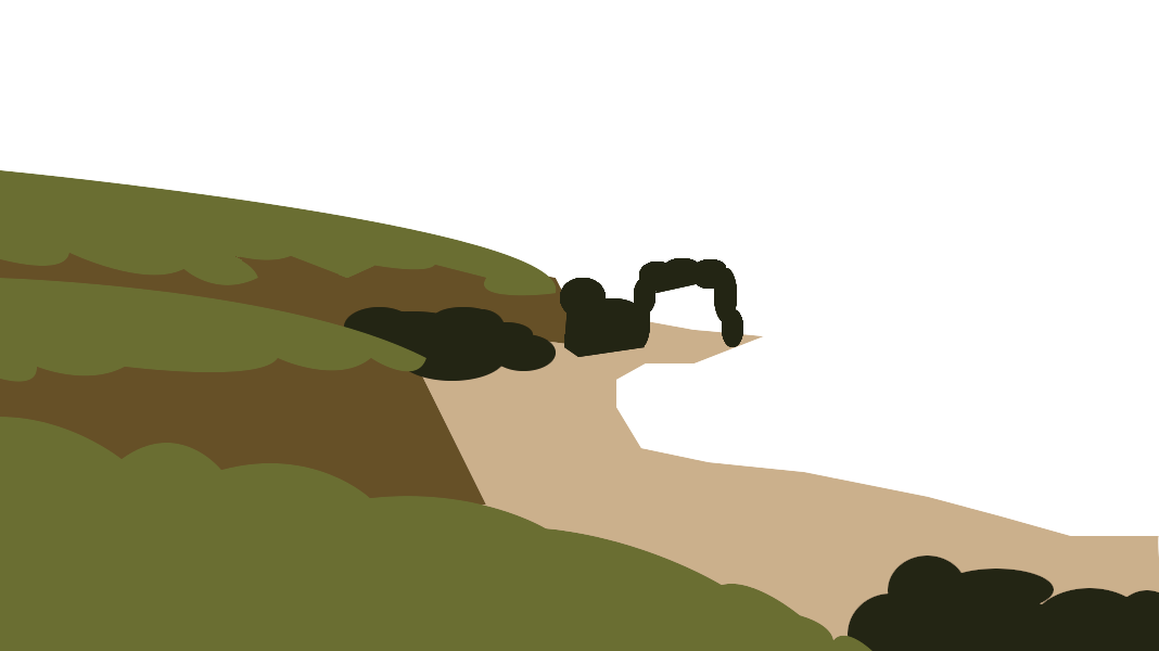
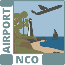
As we move further northeast, we hit the coastline with massive trees and lighthouses. Local sailors gaze up and watch the aircraft depart from Northern Coast Airport (NCO), as they pass over them, on the way across the pond to Europe. I introduce to you their home airport logo:
Northern Coast
Font: OpenSans Ultra-Bold
Font Color:
HEX#719094
RGB: 113, 144, 148
Design Inspirations
Logo Inspiration from:
None, just imagined what would be on a north coast, trees, rocky ocean coast, & light house.
Colors from:
I then lowered the entire image exposure when the layers were combined (except the boarder and AIRPORT/IATA Text)
Okay, I’m gonna take break as I fly across the pond and see what others come up with! Keep em coming CEOs!!!
Where should I land first in Europe? Help me pick a theme (it won’t be a specific place as im keeping these logos I create generic, but help me get inspiration. Feel free to DM me or respond in my ABQ Airport Topic… link below
There is nothing like arriving at Terminal Building International (TBX), airside or landslide, and entering into the beautifully designed piece of art! Walking around the interior and through the skybridge, admiring the architecture and views from the floor to ceiling glass windows, can make you loose track of time. The reflections the glass can take can be are like a movie as life passes by them. I introduce to you the airport logo:
wow, totally random and weird. but I just made another one with a paper airplane that someone messaged me and gave me the inspiration to do. I am waiting for them to respond to see how they like it and so I just came here to see if anyone had posted any new ones… and you used a paper plane too @pikaste. I feel totally bad posting this one I just did. Do you mind if I do @pikaste? Its different in concept, basic too. but it does use a paper airplane and I don’t want to step on your design you just posted. The paper airplanes are almost the same looking though. but just different angles and color. On a side note, great logos!!! glad you did a few and that im not the only one doing multiple ones! ill send you a screenshot of it and you let me know if its okay for me to add to the contest.
A fellow ACEO forum member asked me to create a logo based off their Kochi (also known as Cochin - I thought KOC looked better than COC…lol), India local airport, Cochin International Airport Limited… saying “what captivates me the most of about it is that it’s not a regular fancy logo. It’s minimal. The design is basically a type of origami made from a single leaf of the coconut tree.” I took on the challenge. Its just funny how someone uploaded a paper airplane logo as I was working on mine. I feel they are different enough to upload it. If there is a problem, I will delete it.
Kochi Metropolitan
Font: BebasNeue Bold
Font Color:
HEX#05b5ff
RGB: 5, 181, 255
Design Inspirations
Logo Inspiration from:. Origami made me instantly think of a paper airplane for the logo.
Thanks for the opportunity @Olof@Alexander to let us be creative!
ACEO Airport Logotype Design #6 by TwoCflyer
Update: Spelt International wrong, fixed!
Inspired in combination with the paper airplane and San Diego International Airport Logos, I created Aeroplane International (ARO). I introduce you to their airport logo:
Aeroplane
Font: Cousine Bold Italic
Font Color: Opacity 90% (IATA text goes under logo layer, if possible)
HEX#94dc08
RGB: 148, 220, 8
Design Inspirations
Logo Inspiration from: San Diego International Airport Logo
Clipart Used (created by me)
I traced over an airplane picture with different shapes filling them in with different blue and green paint all in different layers. Then I changed all the shape colors to 70% Opacity and the “International” & boarder to 85% and the IATA to 90% opacity. I then merged all the areoplane shape colors together and put the “ARO” IATA under the “International” layer as well as the “International” layer under the Aeroplane layer for the layered effect.
Transparent, Transparent (w/ boarder) & White (w/ boarder) Background Options:
Hello my friend, please do not have to feel that your design could not be in this post, I would never think it was a copy of my work. And it is still my design that inspired you (which is not the case) it is completely normal that we use the same elements to make logos of something very specific like an airport.
It would not be the first time that common elements were used to reinvent or change the point of view.
Here I leave some real logos of airports that go around our own ideas.