Changes to Zone Overlays
Since I have a tendency to fill in a terminal as it begins to profit I often find myself selecting new items to place and having my screen flash red with the Secure Zone overlay, or even worse- International zones. For one it can be blinding at times when I find myself playing at night, even considering I have a low-blue monitor. More importantly I find the Secure and International zones make it difficult at times to see the rooms I am working on.
Description:
The present system of building in Airport CEO will summon the zone overlays each time you select a new item, take for example the test bathroom I have in screenshots below. I find it difficult to pay attention to what I am building, as each time I switch between a sink and a toilet for example, I find myself going back to disable the international zone so I can see my work area more clearly. Although under some circumstances backgrounds like that give good contrast to see what you want to build, the international zone, and more importantly secure international zones are more likely to make it hard to concentrate on my work.
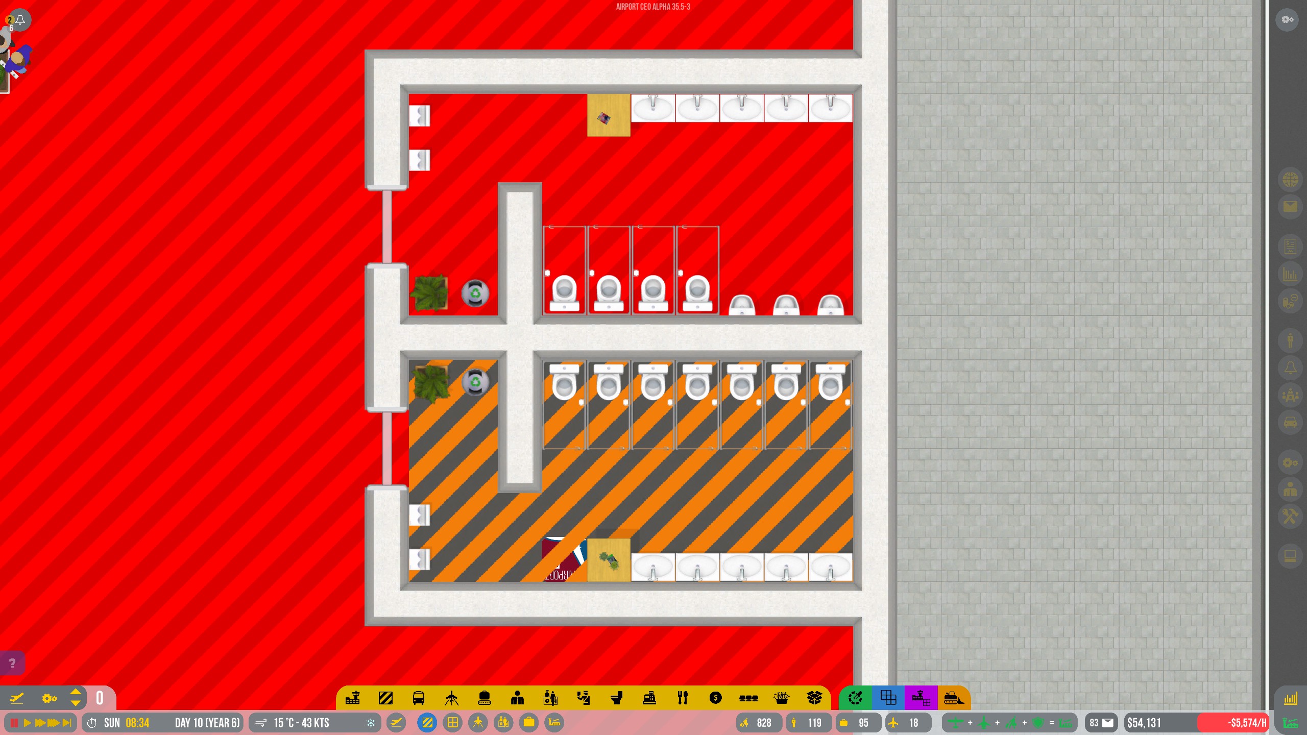
In the examples below I have the bottom bathroom zoned for staff to show what I think could be a good solution.
Ex. 1: Both International and Secure Zones next to Staff zone. (Note visibility of airport logo and floor color on bottom bathroom.
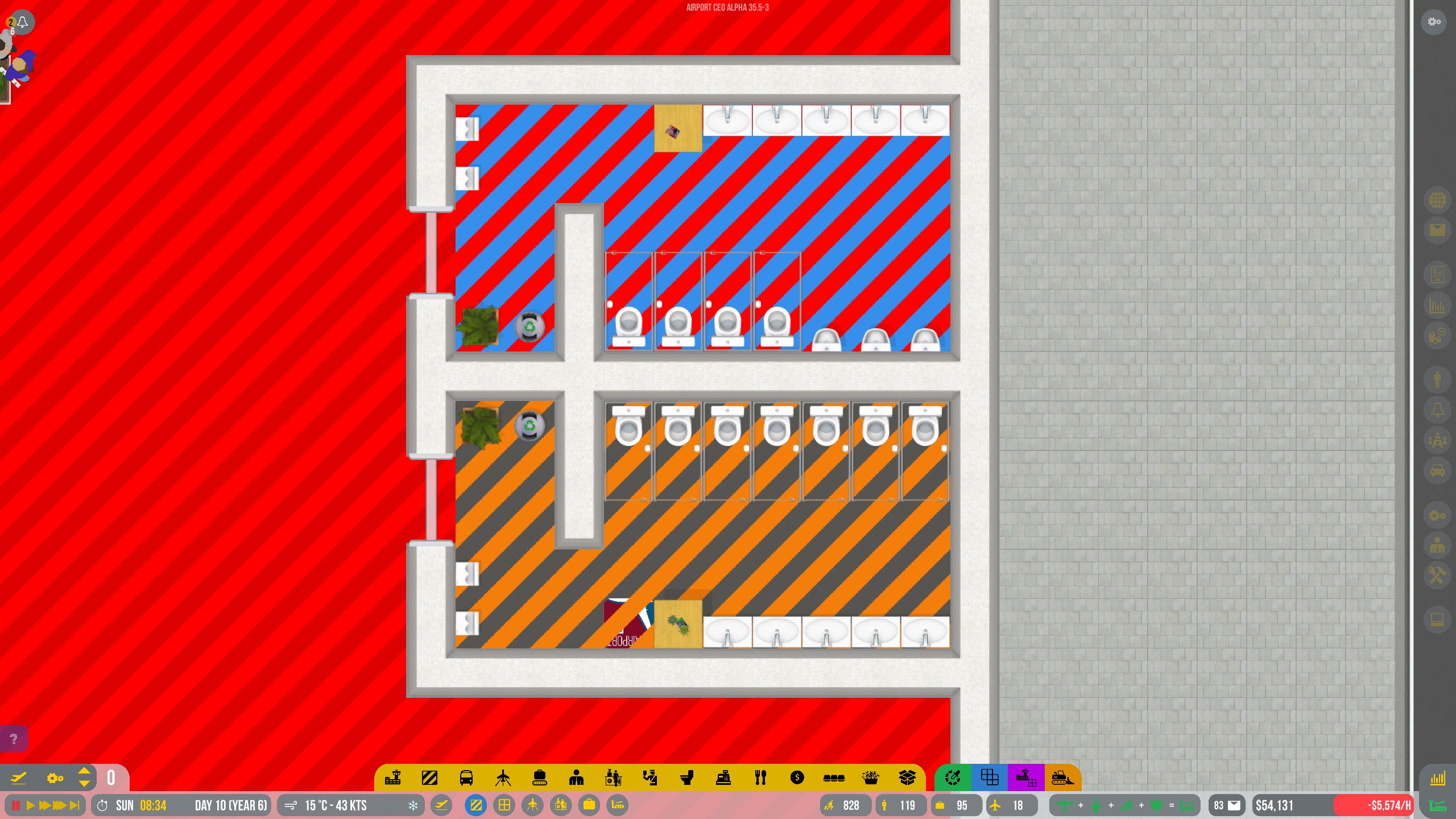
Ex. 2: Secure Zone above Staff zone.
My proposal:
In both of the examples I have attached it is easy to see the slightly dull orange used for staff rooms is both less intrusive and easier to work with, i.e. you can see the floors below and all items clearly. I would suggest that the blue and red stripes currently used have two changes made to them.
-
Bring the opacity of the markings down towards 50% or even 25% to allow better visibility of the work space.
-
Reduce the chrome/vibrant effect of the two colors so they are less flashy and aggressive on the eyes.
-
An alternative option: Offer a toggle in the gameplay settings that would allow players to disable the zone pop-up when selecting construction items from the taskbar.
Why it should be implemented:
I see this proposal as a small quality of life improvement for the game that would make it more convenient for construction in buildings that have already been zoned. It would also allow the player to better see what the end result of their placed items will look like without them having to disable the zone overlay again. Finally, if option 3 is implemented it would allow players to have full control as to when they intend to bring up the zone overlay, and it would be a great improvement.
Thanks for reading!
I’m happy to discuss this in the comments.
P.S. I checked to see if a similar feature request existed on this forum and could not find one. If this has already been requested please message me and I will take this down.