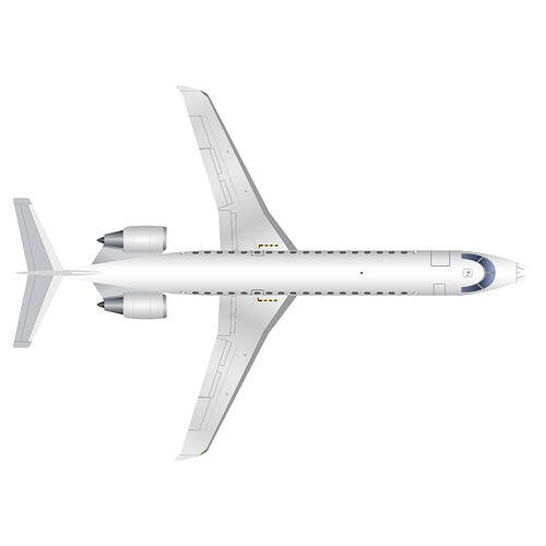
Hi everyone! As a way to get myself hyped up for AirportCEO I decided I would spend time working on my graphic design skills by recreating the AirportCEO CRJ-700 from the Airline Design Contest. For those who are not interested in a comparison of the two and what I learned from this project then here is the finished picture for you.
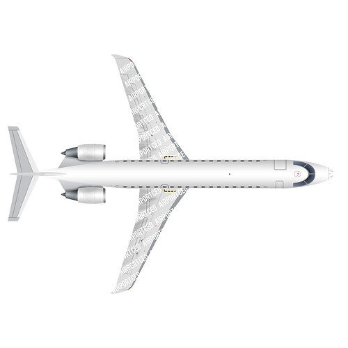
This right here is my finished product. Below is the original image I worked off of.
So yeah. That’s what it looks like! Now let’s get into what I learned and what’s different between the two.
Aircraft Shape:
The shape of the aircraft to me looks very similar to the original. No surprise there. From starting right here I learned a lot about getting the shapes that I want exact and also a lot about gradients. Before I started this I didn’t really think about using gradients at all. Now I truly know and understand the power of them.
Windows, doors, etc:
One fine detail that you can see in the aircraft windows is that there is a little shine/glare to it. Instead of just doing a solid color with a little bit of shading I decided to see how it would look with a shine/glare looking gradient. In the end, I ended up liking it better. The doors were pretty straight forward and the cockpit window too. Although the gradient for the cockpit windows did trip me up a little bit. As you can see instead of having it go dark to light like the original somehow for the front windows it got a little too bright. Now realizing this I probably should have made the windows one shape and not separately and then use a radial gradient.
Tail:
The tail again was another pretty easy part. Although when I was making it I didn’t expect to see a lot of detail there. If you zoom into the original image you can see that there are really small weld marks. Great job there devs! I attempted to do that same thing although it didn’t really look that right. So I opted to just not put them in.
Engines:
The engines were another part that was pretty easy. Again there we lot’s of gradients needed. The part that surprised me was the detail in the engine shadows. On the original, you could tell it was used with a Photoshop brush of some sort and then had the opacity pretty low. I did not use Photoshop for this and instead used Inkscape. So I didn’t really know the best way to go about it. I tried some things but none of them were able to get the same effect. So I took the shape of the engine, applied a gradient, and called it a day.
Wings:
The last part I did was the wings. Overall they came out pretty well. The one part which I wasn’t able to replicate was the wing shadowing. I did use some gradients again to try and reach the same effect. Overall it does have a much cleaner look than the original. Even without the watermark.
Remarks:
Overall I think I did a pretty good job replicating the whole aircraft and even throwing my own twists. I can really now apprecieate the design and time spent on the developers for creating the aircraft. The next project I will do is most likely taking a top down view blueprint of another aircraft and then building and doing all of the design work myself. And not trying to match an image. If you got this far then thanks for reading my post!


