@Beumer
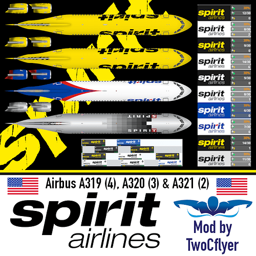
you mean logos? I try to find the best one possible, if not and its not too difficult of a logo, I recreate it myself. I also get text from “what the font” MyFonts.com website. I take a picture of the font I want. I upload it to the website. Then I pick the closest one they give me options for. I put in a sample text that I want to see in that font. Then I screen capture that text in the largest I can. Then I Take the white back ground out and color overlay the black text to the color I need. Hope that helps
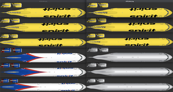
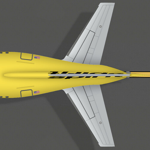
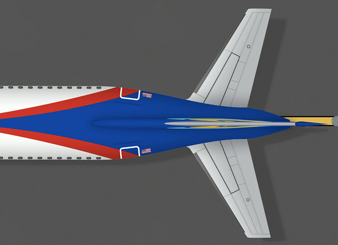
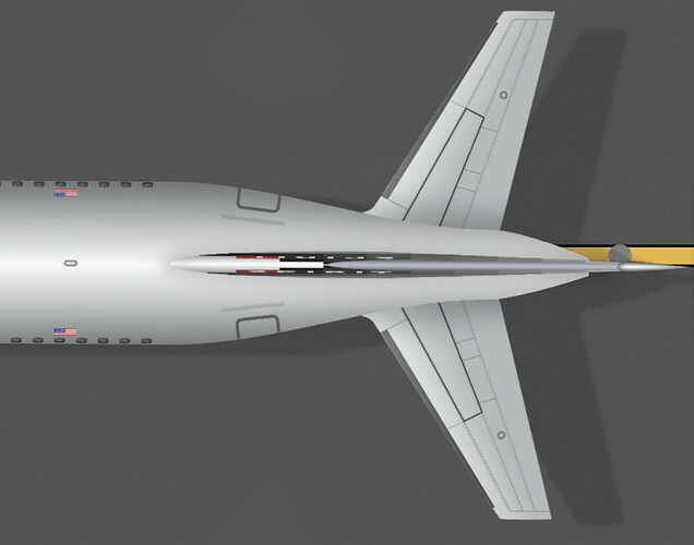
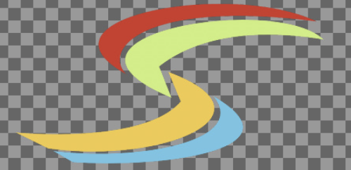
For example, I recreated the S logo for the fin in the colors red, green yellow and blue by tracing the outline of the fin logo from a picture and then filling it in with color. Its not exact, but its good enough cuz im going to squash the heck out of it to put on the fin. lol
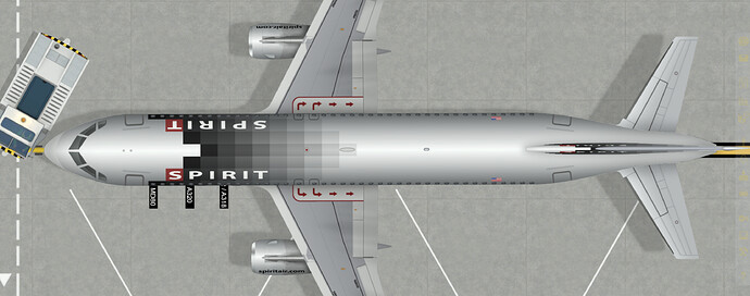
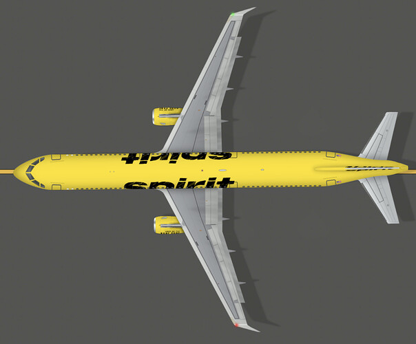
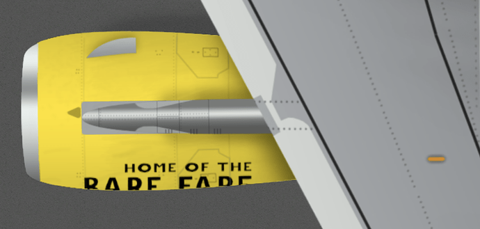
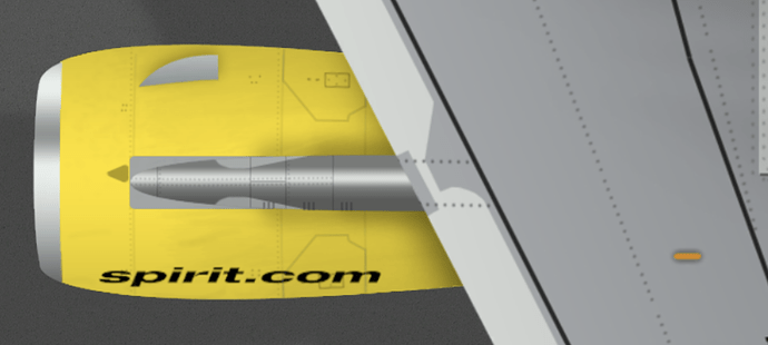
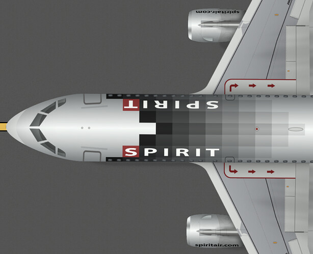
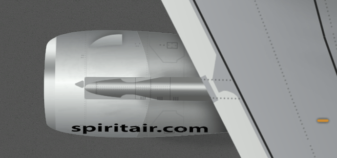
I got the spirit.com, airlines, and SPIRT text from MyFonts.com, google “what the font”
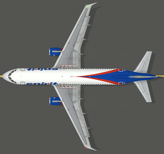
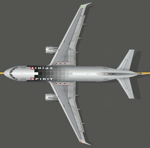
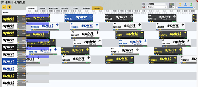
The black and blue box shading I created myself as well
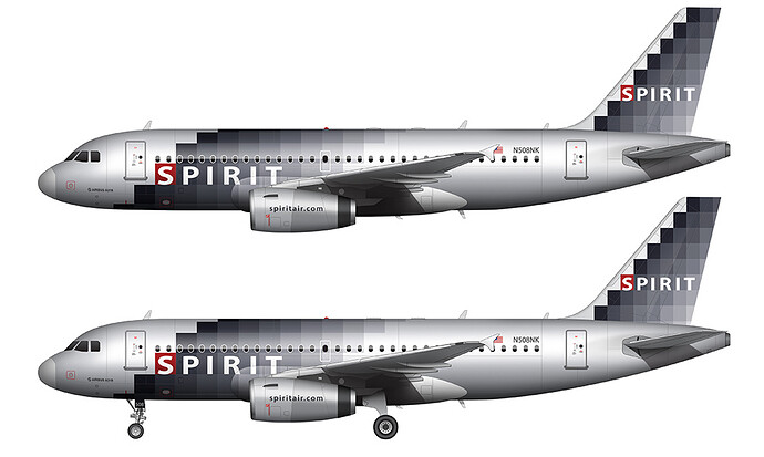
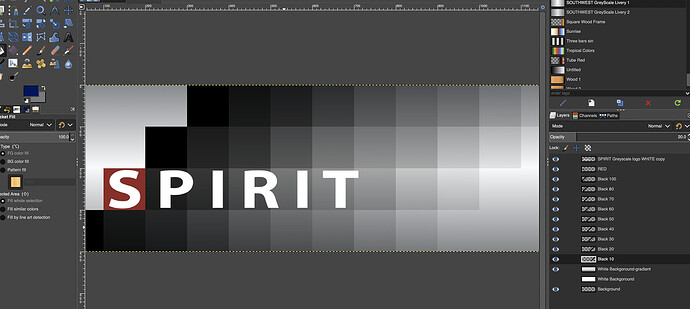
I made an image 400 height by 1200 wide pixels. Then I did rectangle select tool and made squares 100 x 100 and placed them every 100 pixels and filled them first with black then with blue for the other one. I did the first layer all in 100% opacity, second layer in 98% opacity, third in 96, 90, 80, 70, 60, 40, 20% opacity. Then I made the blue one. added the red box and then the SPIRIT white text that I got the from what the font by sampling the text they told me it was and screen capturing it. Then I exported it all as one layer.
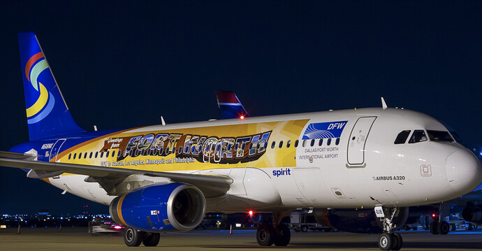
The Dallas and Fort Worth Images I screen captured from the side of the aircraft from googling that aircraft and picking the largest image I cold find.
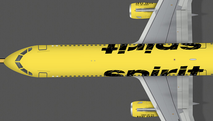
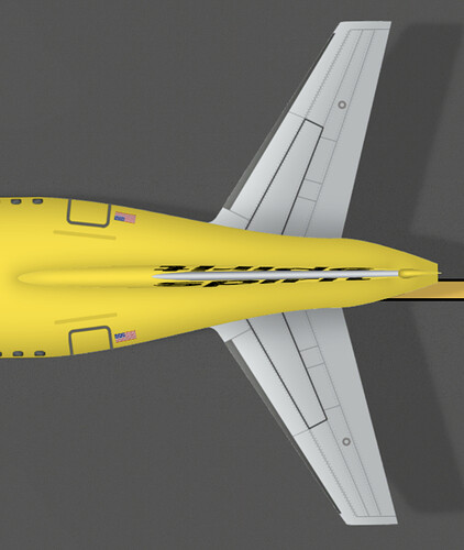
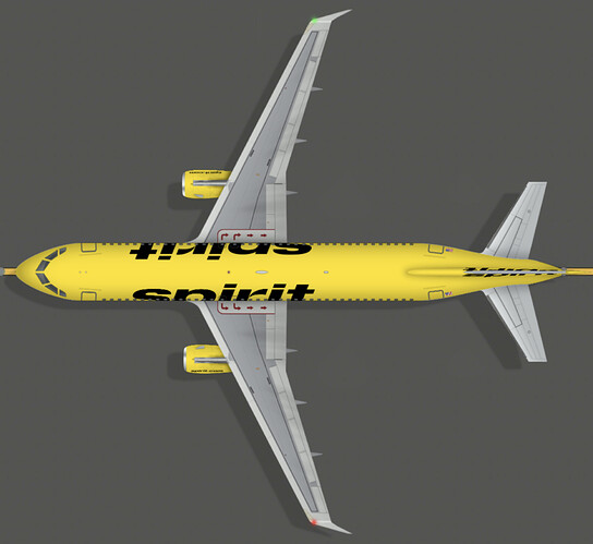
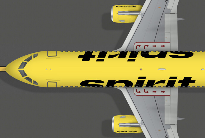
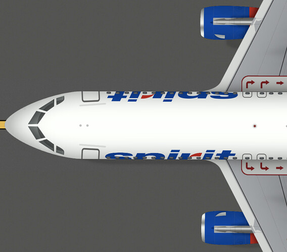
The 2 top left black Spirit Logos I just found a really good quality transparent one via google. The top 2 are from downloading, and the other black, yellow, white and blue/red ones are just color overlays
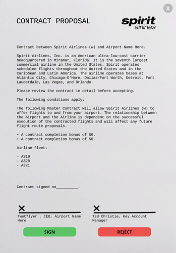
oh, and the spirit.com text I had to cut off part of the R to make it look like the other Spirit logo cuz the R is changed from the original font that spirit used for their logo. So its the same font they used, but just a section of the “r” is cut off…
The blue and red R Spirit logo I color overlayed the black logo I found with red for one layer and blue for another, I cut out the red for all the letters except the little red part of the R and cut out that same R part of the blue and then merged the two layers together. I did this because I could not find a good quality red and blue Spirit Logo
![]() well, if I can get the DFW and Dumbo one done good enough…
well, if I can get the DFW and Dumbo one done good enough…![]() so excited!
so excited!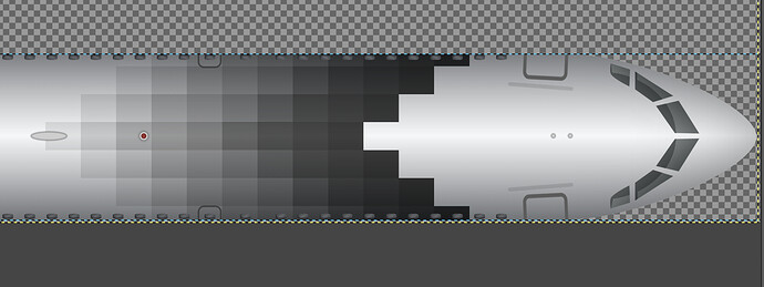


 thanks anyway